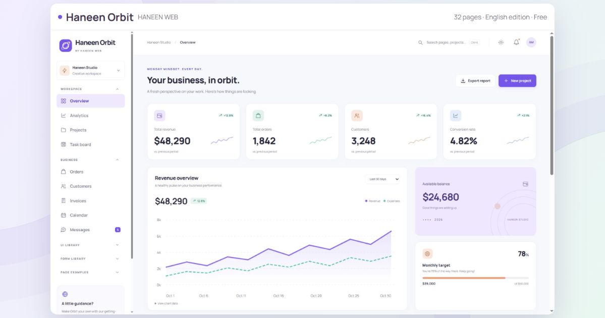
A store, CRM or SaaS workspace needs more than an attractive dashboard: it needs forms, buttons, tables and clear loading, empty and validation states. Haneen Orbit by Haneen Web brings these foundations together in a free admin dashboard template with 32 pages per language.
This illustrated guide tours most of the interface using real screenshots, explains the local demo behavior, and shows how to start customizing and connecting it to your application.
Download and preview the English edition · Arabic RTL edition
Who is this template for?
Developers and small teams can use the components for a store admin, customer CRM, project tracker, content tool or digital-service workspace. Choose the screens you need and connect your data. The template does not define your business rules or replace backend development.
Independent English and Arabic editions
Each download has its own pages, editable source, fonts and documentation. English uses LTR layout; Arabic uses RTL. Neither package depends on the other. Responsive layouts support phone, tablet and desktop sizes, with dark mode and appearance options.
In this guide
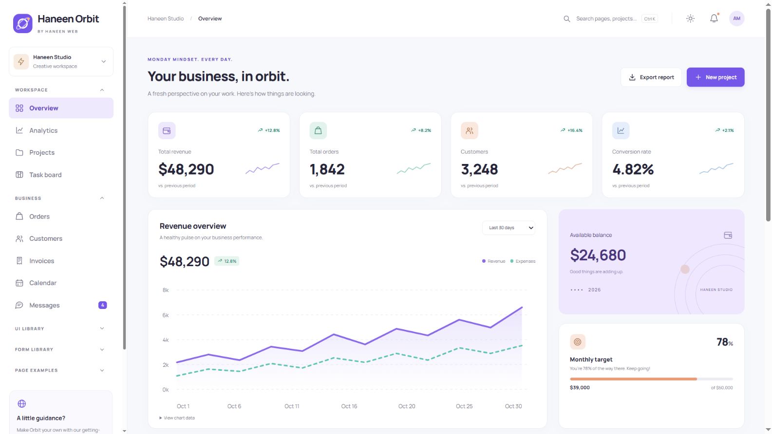
A clear overview of your workspace
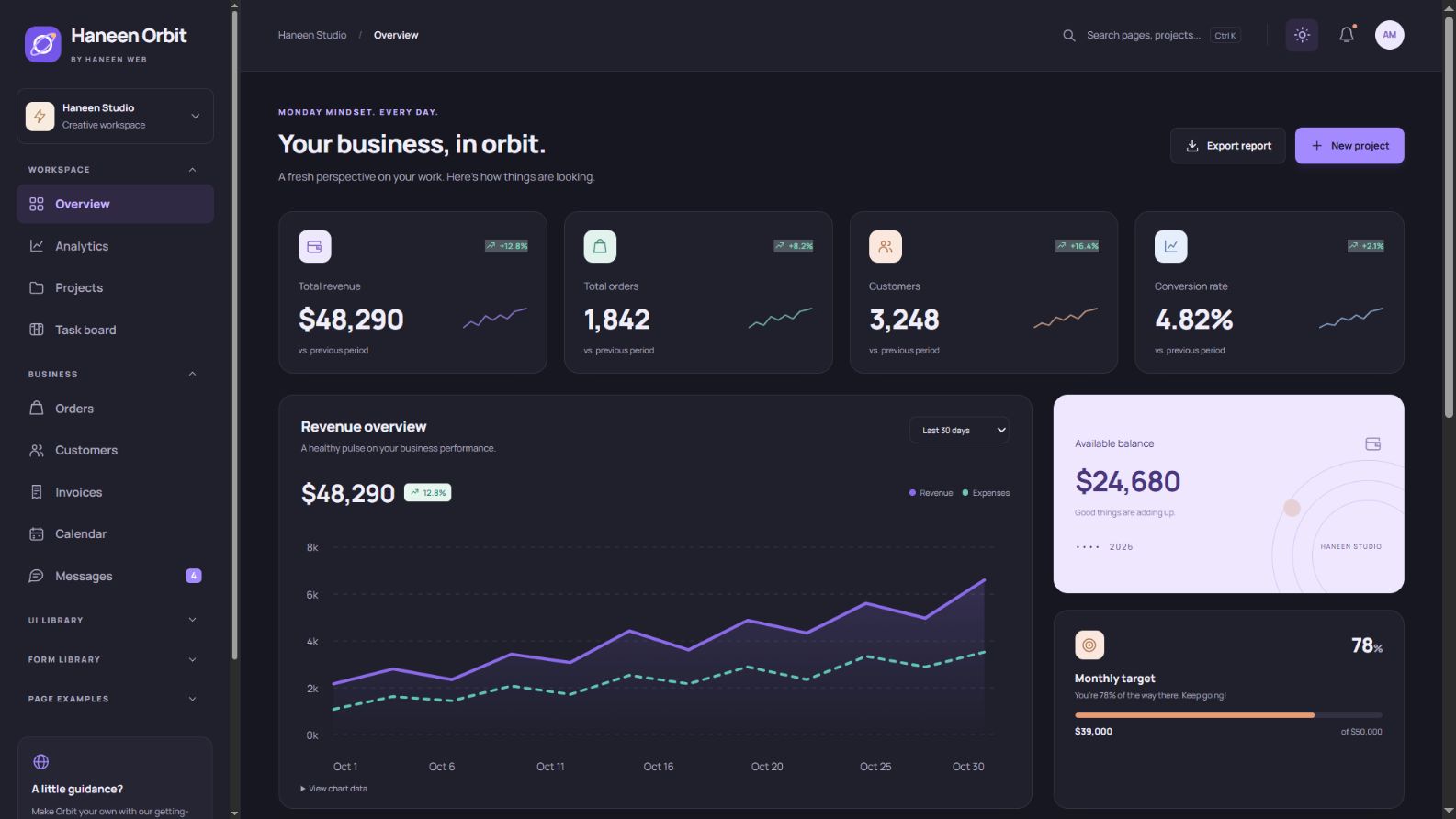
The overview combines revenue, orders, customers and conversion cards with revenue and expense trends and a monthly target. Switch the reporting period, inspect the chart data table, and export the report. These metrics are an illustrative dataset separate from the smaller sample order records; connect your own data to create a real business overview.
Analytics and performance
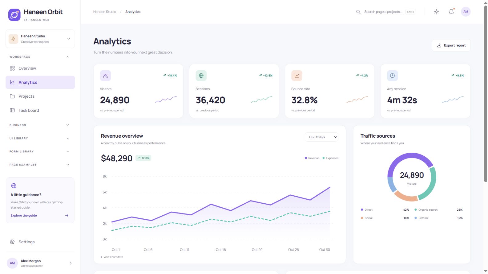
The analytics screen organizes traffic sources, devices, pages and performance. Its cards and charts can become reporting blocks for a content site, store or SaaS product. The sample figures explain the layout; they are not connected to a live analytics service.
Projects and project details
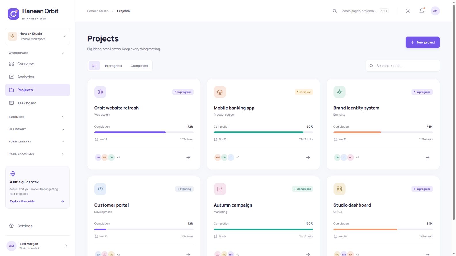
Project cards display a name, category, status, progress and team. Add a project, edit its details, search the list and open its detail view. Demo changes can be stored in the browser when storage is available, with a reset option in Settings.
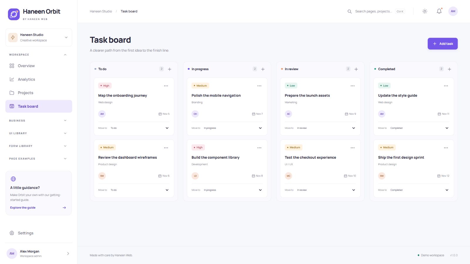
A practical Kanban task board
Tasks are organized into clear workflow columns. Move them by dragging or by choosing a status from the accessible select control. The latter also works well on phones and with a keyboard. Add your own permissions and synchronization when integrating a shared team workflow.
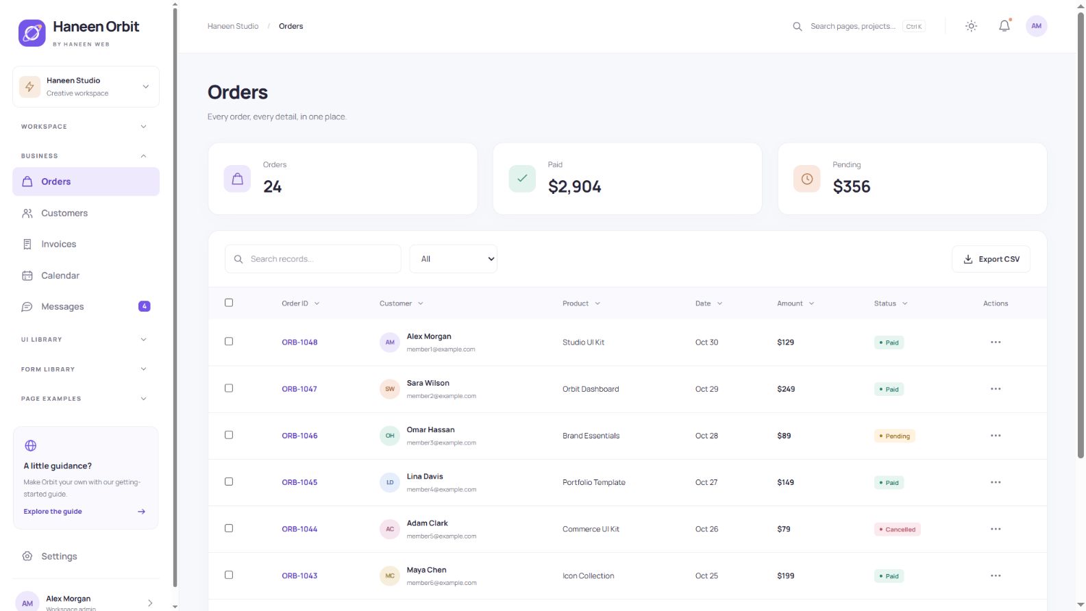
Orders with search, filters and CSV export
The order table includes literal-text search, status filtering, sorting, row selection and pagination. Export results to CSV for use outside the interface. An explicit empty state helps users understand when a query has no matches.
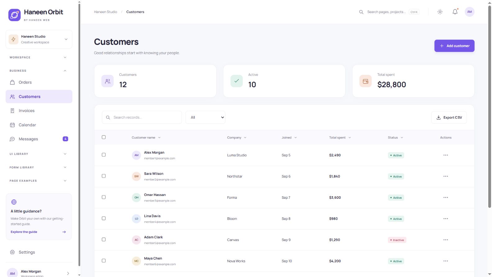
Customer records
The customer screen combines a searchable list, sample customer information and forms for adding or editing a record. It is a useful starting point for a CRM or subscriber interface. Production privacy, authorization and validation belong in your application backend.
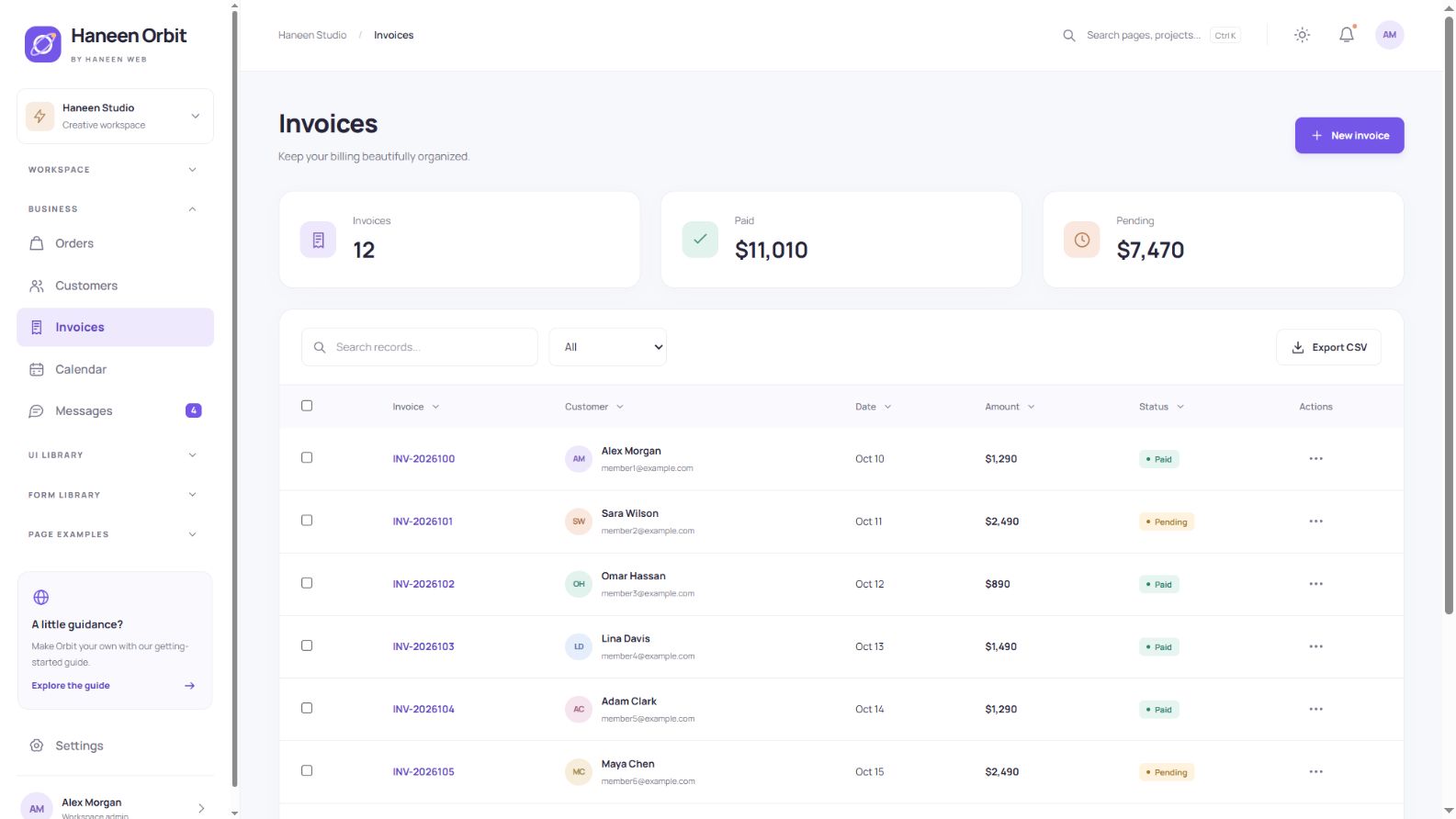
Sample invoices and detail views
Invoices show customer, date, status and amount, with a sample invoice creation flow and a printable detail view. They demonstrate a billing interface; they do not collect payments, implement accounting rules or connect to a payment provider.
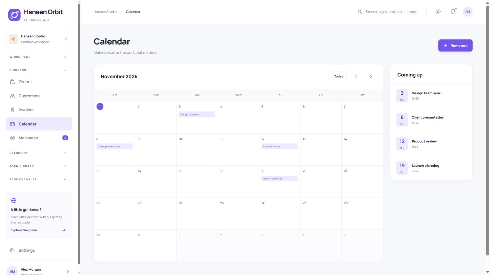
Calendar and events
Navigate between months and add, inspect or delete local demo events. The pattern suits appointments, content schedules and project reviews. Events are not synchronized with external calendars, and the template does not send real reminders.
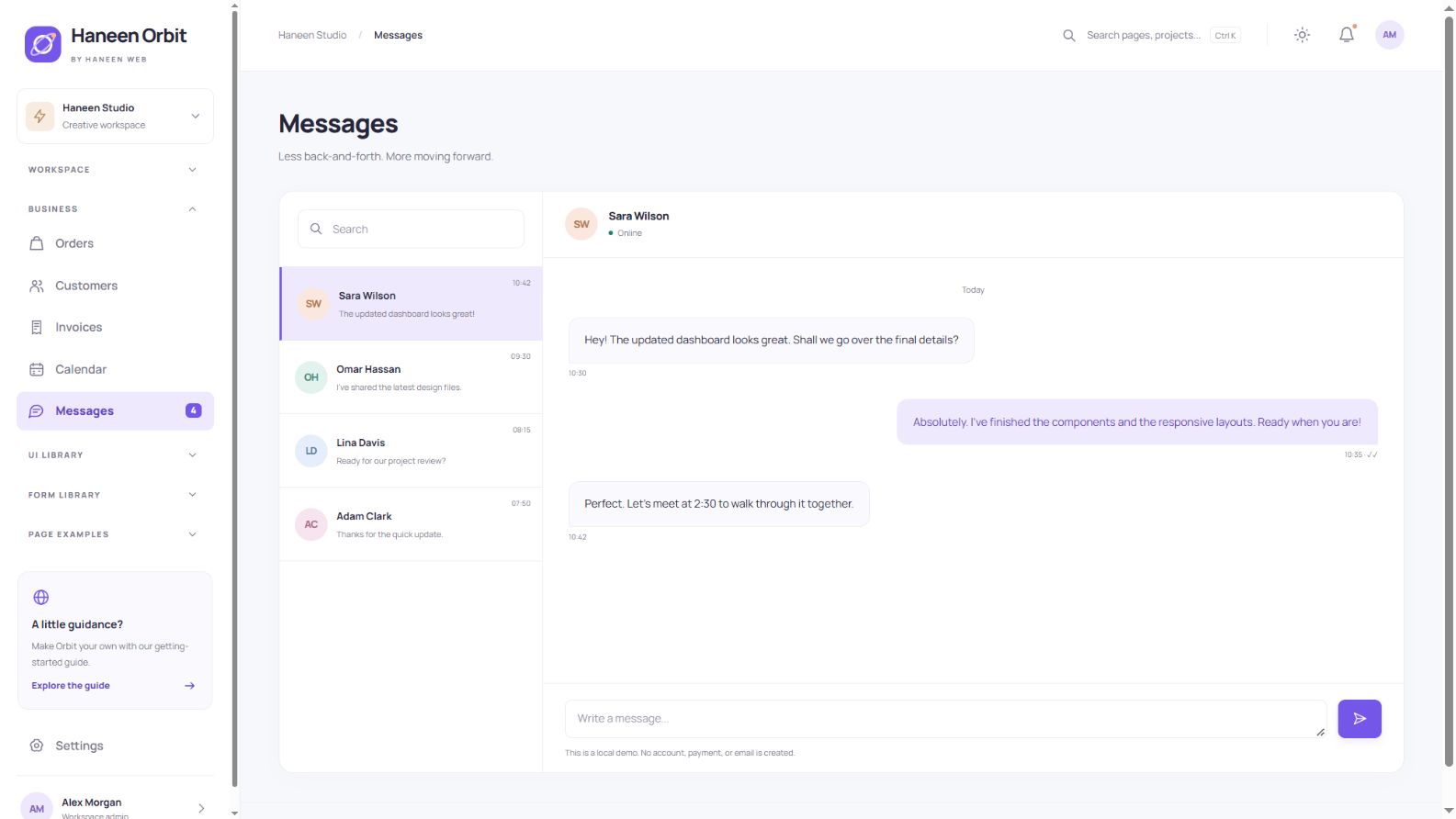
Local conversation interface
The message screen has a conversation list, readable message thread and composer. New messages appear locally as escaped text. To support real conversations, integrate authentication, storage and a messaging service.
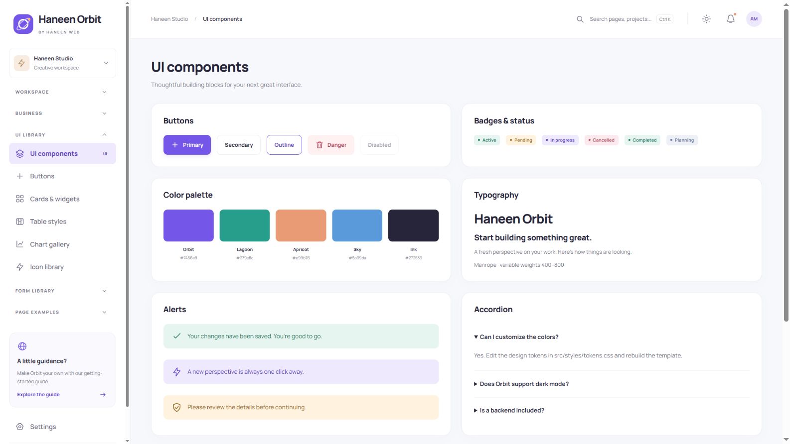
Reusable UI components
The component overview brings together badges, alerts, color and typography samples, tabs, accordions, dialogs and toast notifications. Shared patterns help additional screens stay consistent with the rest of the product.
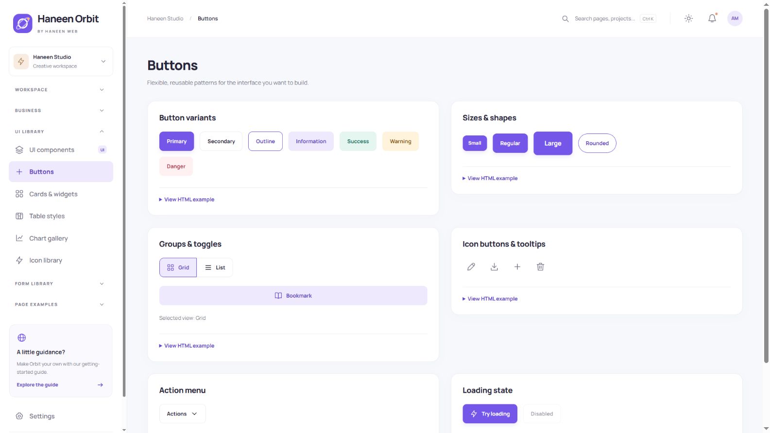
Buttons for everyday actions
Choose primary, secondary, outlined and semantic buttons in several sizes and shapes. Examples include grouped buttons, icon actions, tooltips, an action menu and a loading state. Expand the HTML example to inspect the exact markup behind a component.
Cards, widgets and progress
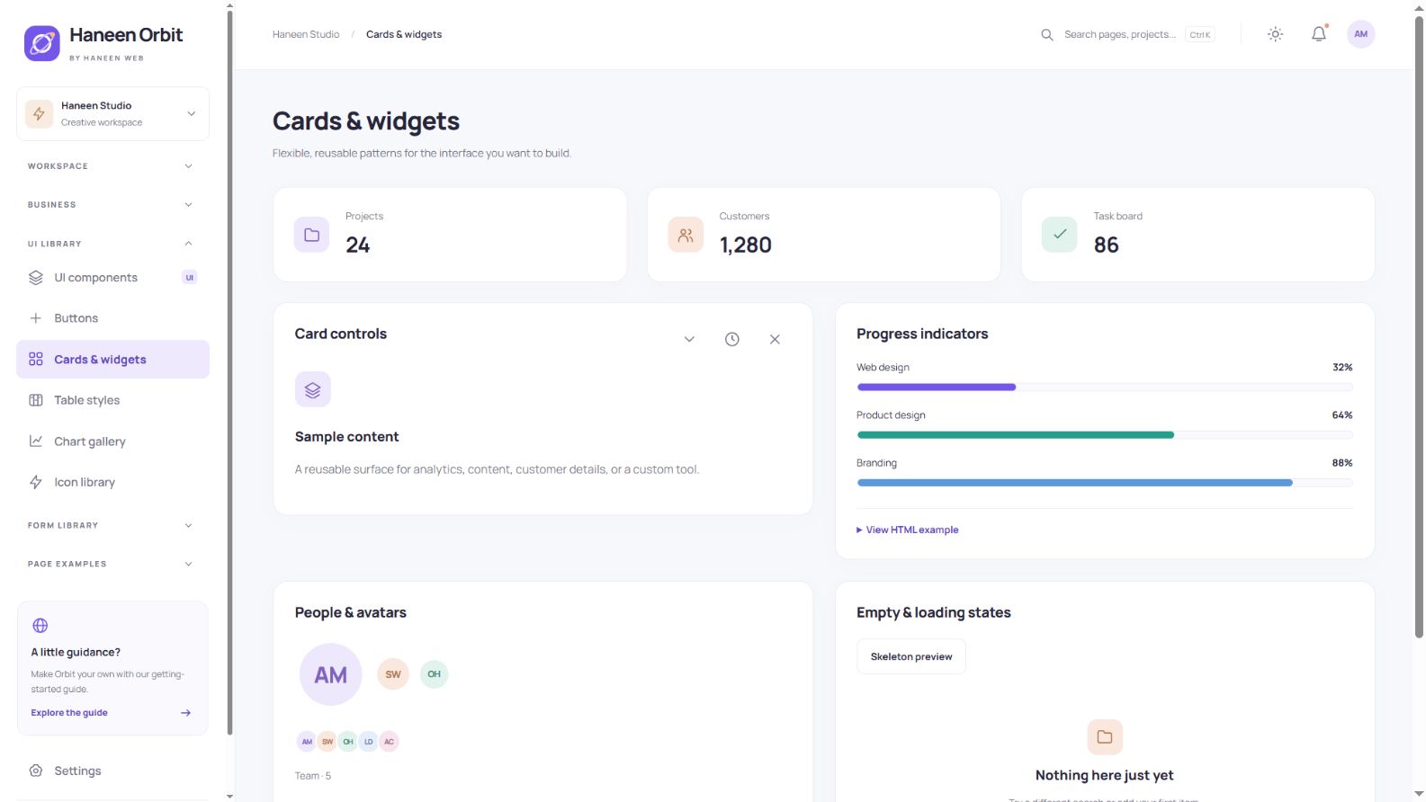
This page includes metric cards, progress indicators, avatars, empty states and a skeleton preview. Card controls demonstrate collapse, refresh, dismiss and restore behavior, showing useful interface states as well as the visual surface.
A broad form-control library
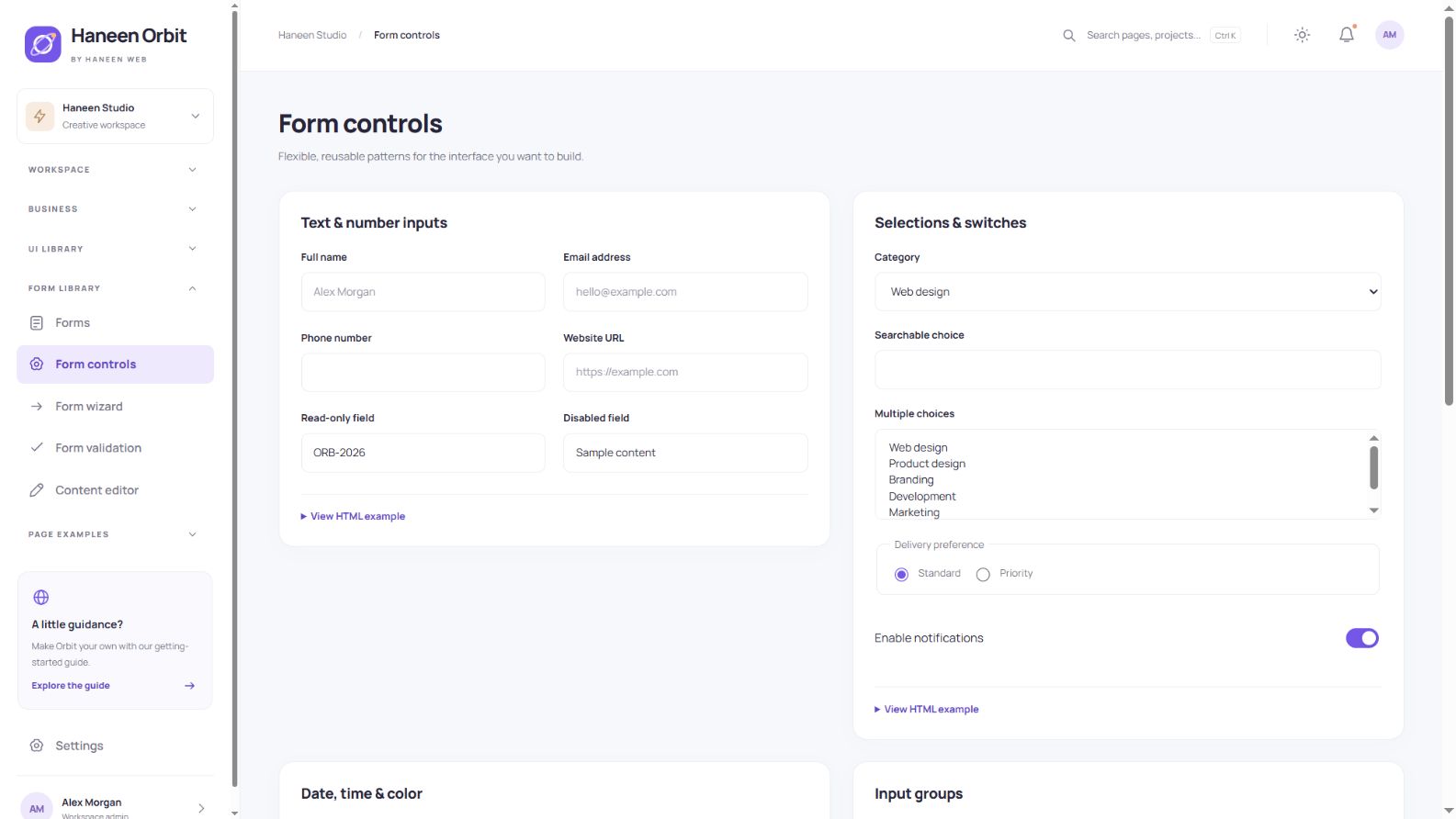
Explore text, email, telephone, URL and numeric fields; ordinary, multiple and searchable choices; checkboxes, radios and switches. The library also includes date, time, color and range inputs, input groups, a character counter and password visibility. File selection shows local names and sizes without uploading files.
A validated three-step wizard
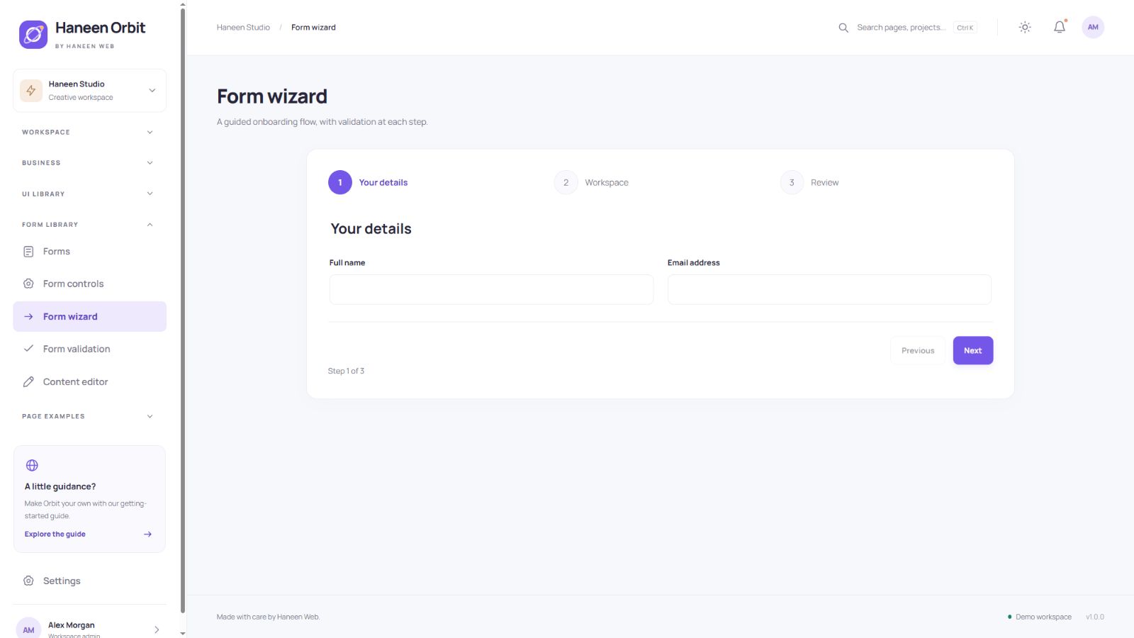
The wizard separates personal details, workspace information and a final review. Validation runs before advancing, and going back preserves entered values. Reuse the pattern for onboarding or a multi-part request; the demonstration does not create a real account.
Validation and useful feedback
Validation examples cover required fields, email and URL formats, reference-code patterns and numeric limits. Messages appear beside the relevant fields, with focus moving to the first error. The Arabic edition has localized feedback. Production applications must also validate and authorize data on the server.
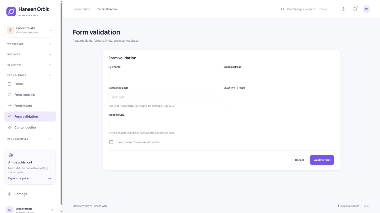
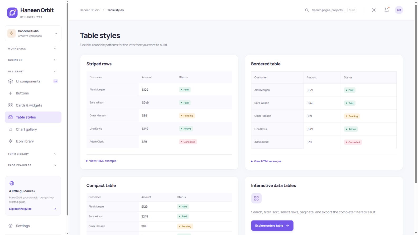
Table styling patterns
Alongside the interactive business tables, the catalogue includes striped rows, bordered tables and compact spacing. Select a presentation that fits your data density. The included export format is CSV; dedicated Excel and PDF exporters are not bundled.
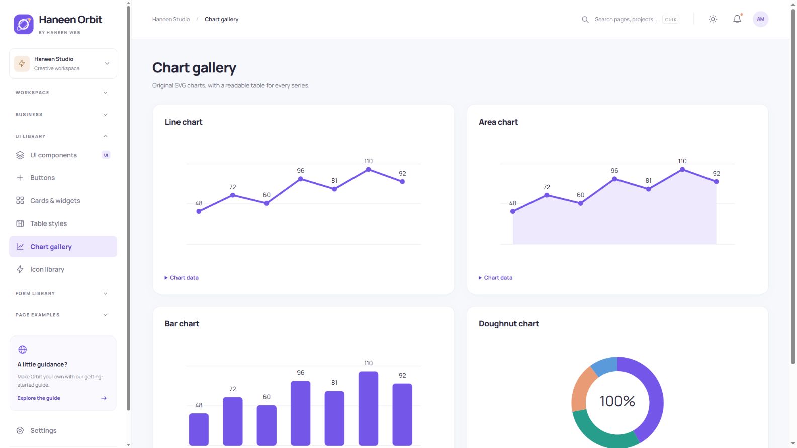
Charts with readable data
The chart gallery includes line, area, bar and doughnut examples, complemented by metric sparklines. Original SVG graphics are paired with readable data tables. The bundled examples run without an external chart package.
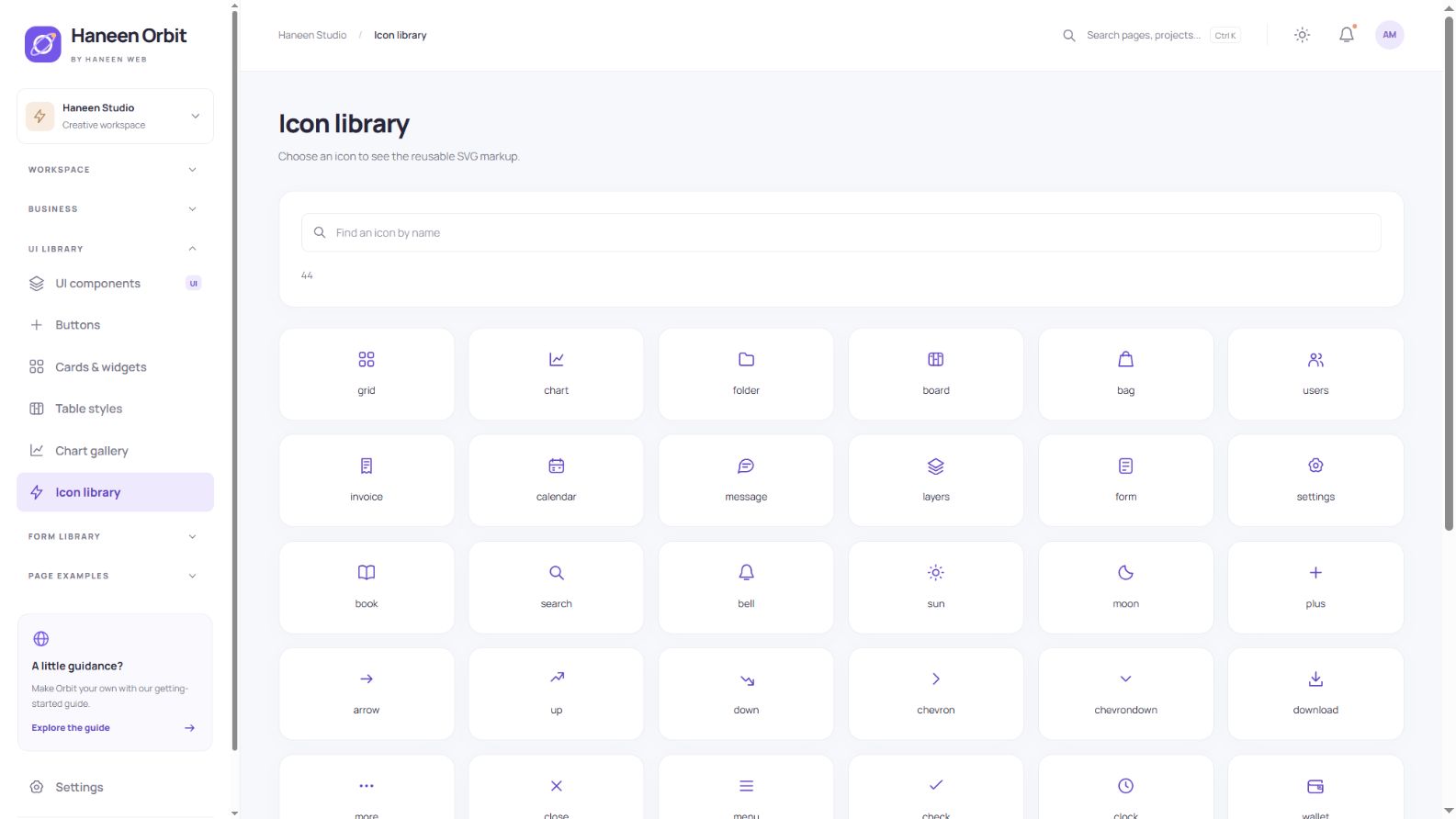
Original icon library
Search the original icon set by name and open an icon to inspect its reusable SVG markup. The icons share a consistent outline style and inherit their surrounding color, making them suitable for navigation, buttons and cards.
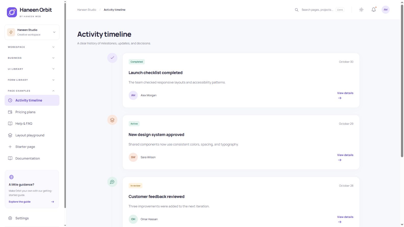
An activity timeline
The timeline demonstrates milestones, team updates and activity history. Each entry combines an event title, date, description and associated person. Replace the sample content to reuse the same presentation for a different workflow.
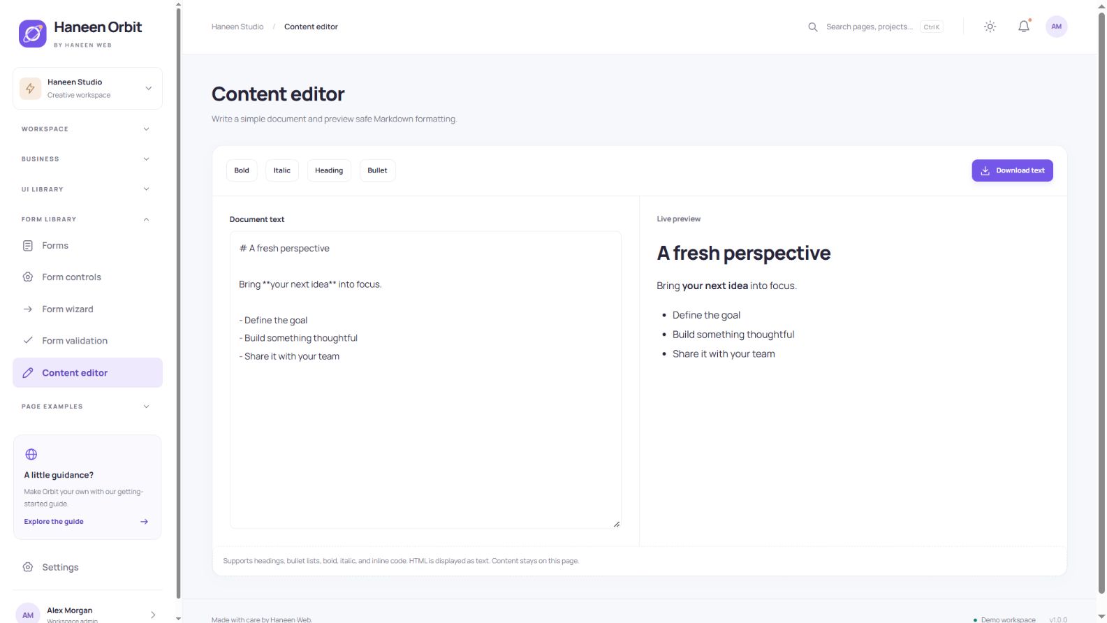
Content editor and safe preview
Write headings, lists, bold or italic text and inline code, inspect the live preview, and download the document. HTML is displayed as text rather than executed. This is a small Markdown subset, not a full WYSIWYG editor or a connected publishing system.
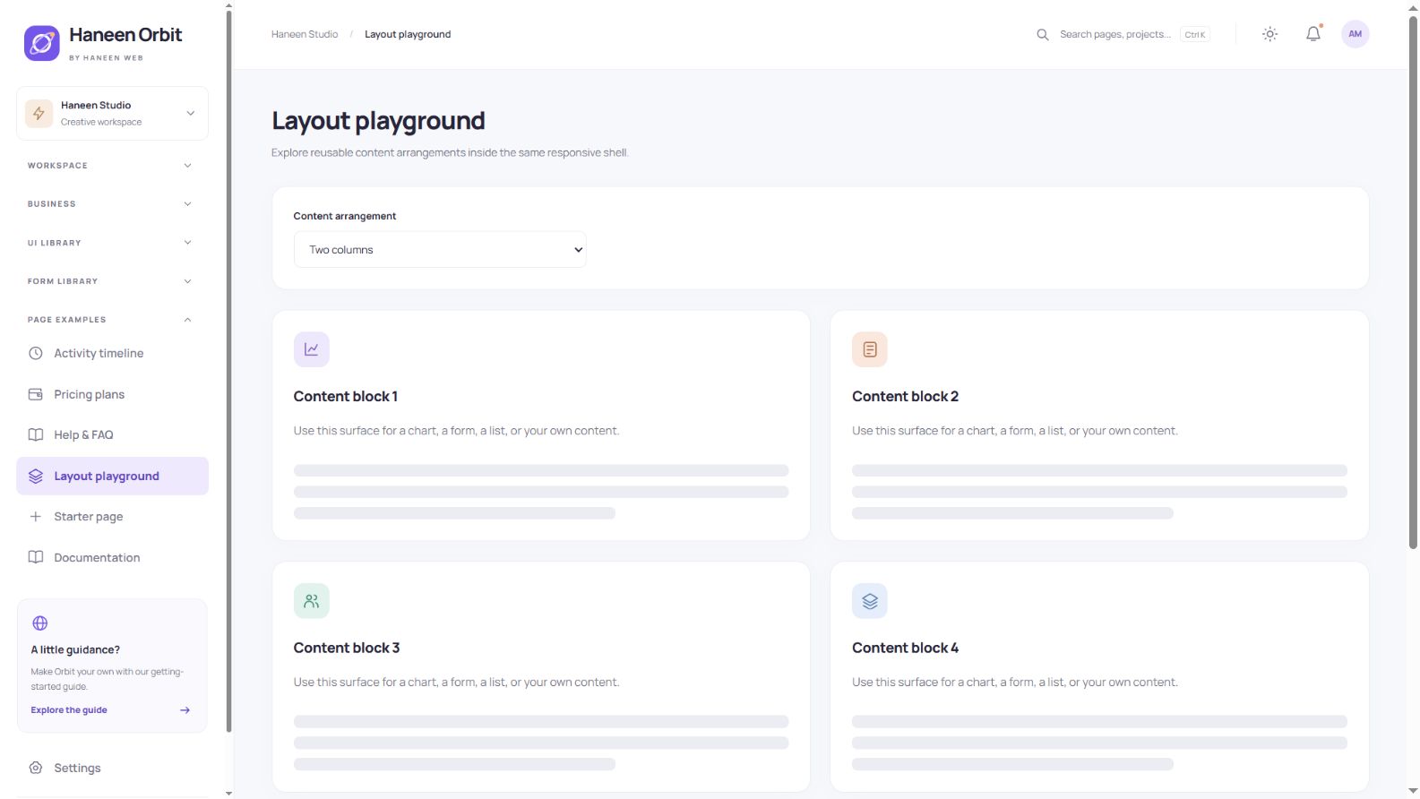
Layouts for different use cases
Try one, two or three content columns, or a main area with an aside. Use-case links point to store, CRM, content and SaaS patterns. The template becomes specific to your project through the components you combine and the application rules you implement.
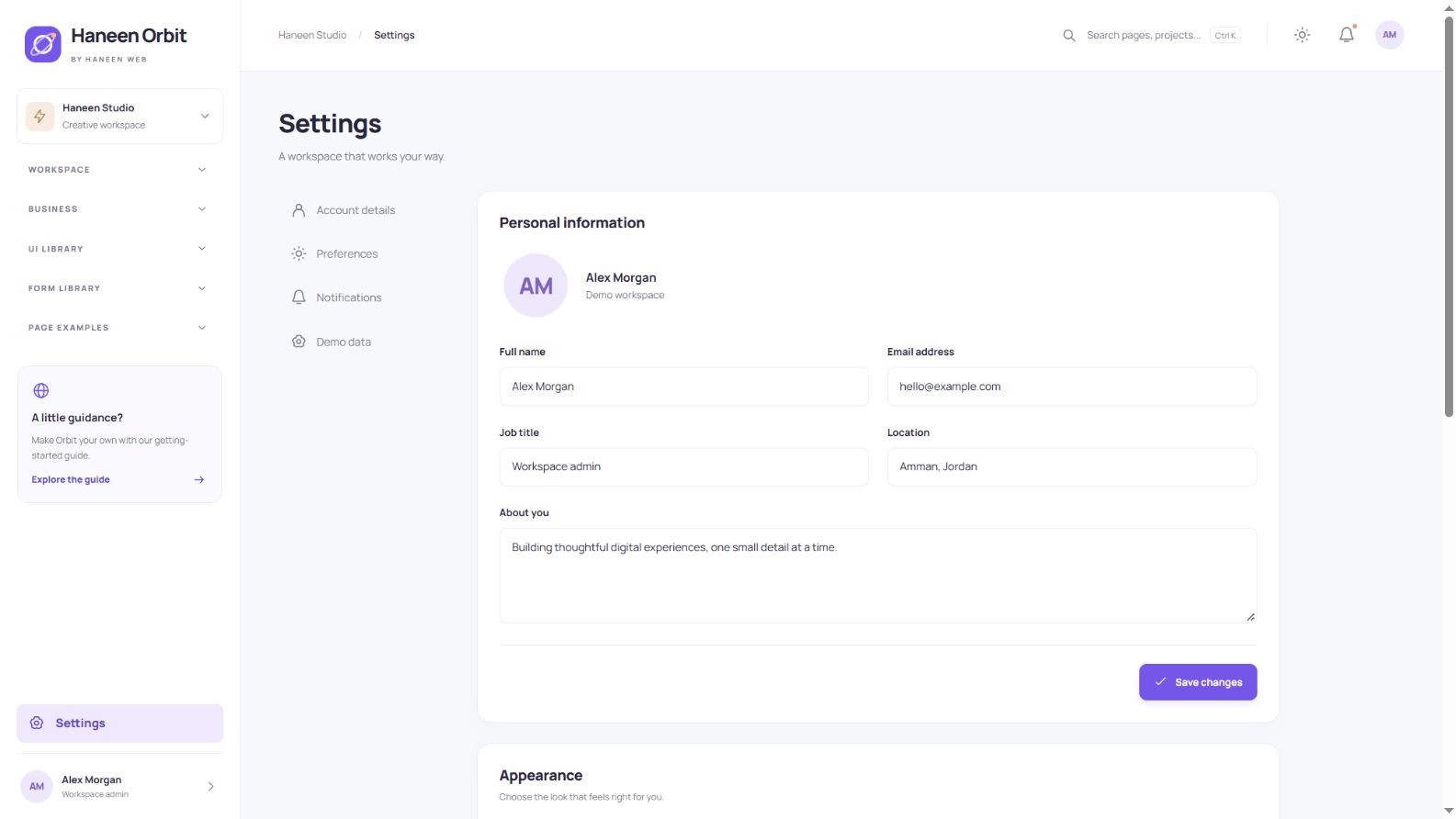
Appearance and preferences
Choose light, dark or system appearance, switch the accent color and adjust layout density. Settings also include profile fields, sample preferences and a demo reset. Notification preference switches do not send real email.
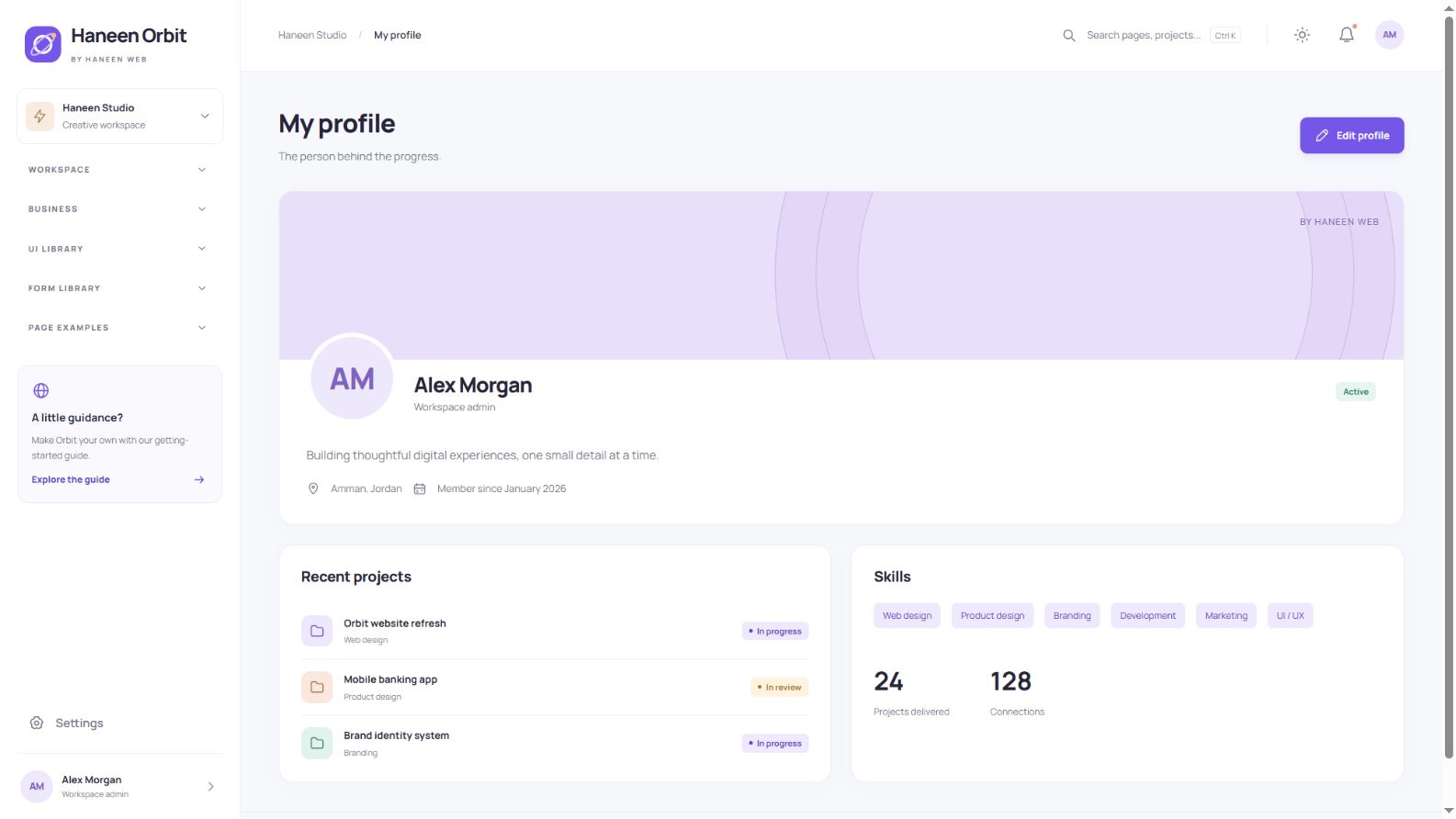
Profile presentation
The profile combines a cover, avatar, name, biography, location, skills and recent projects. Edit the sample details from Settings. Reuse the structure for a team member, administrator or service provider after connecting your application data.
Sign-in, registration and recovery screens
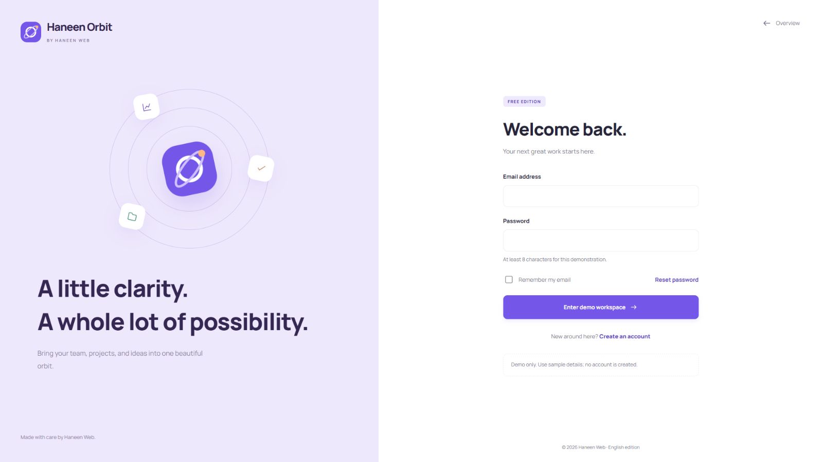
Separate sign-in, registration and password-recovery pages share the same identity. The demo validates fields and password matching, but it does not register users, store passwords or send recovery email. Connect a proper authentication system for production.
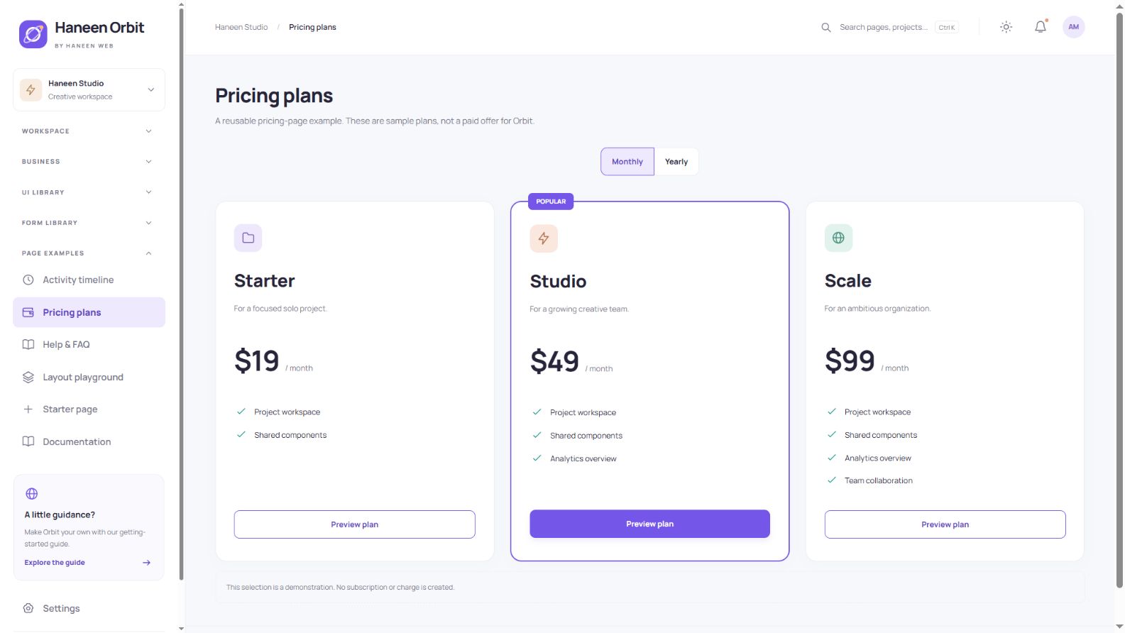
A reusable pricing example
The pricing example presents three plans and a monthly/yearly toggle. Selecting a plan opens an explanatory dialog and does not create a subscription. These sample prices are not charges for Haneen Orbit; the template download is free under its included license.
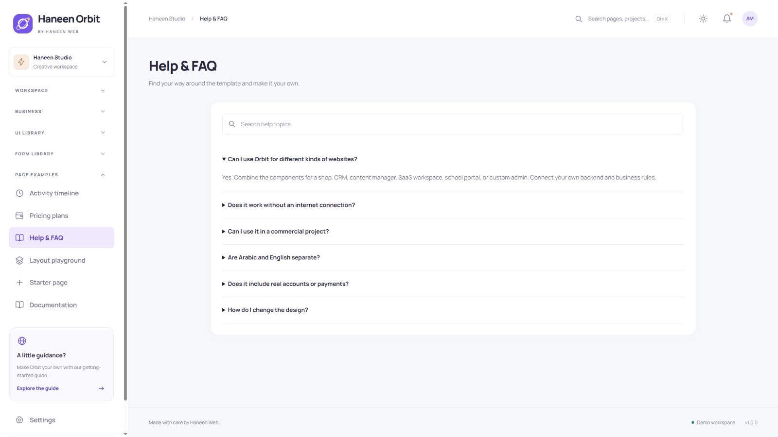
Searchable help and FAQ
The help page provides searchable, collapsible answers about setup, customization, licensing and scope. A developer starter, in-package documentation and a 404 screen complete the core page set.
Dark mode and visual consistency
Switch appearance from the top bar or Settings. Shared design tokens control colors, spacing and typography so customization stays consistent across screens. This is the same interface in dark mode.
Download and run the template
- Open the product page for your preferred edition using the links in this guide.
- Use Download and follow the store’s existing sign-in and download steps.
- Extract the ZIP and open
index.htmlto explore the interface. - Read
START-HERE.txtand opendocumentation.htmlfor the component guide.
What is inside the download?
The root contains ready-to-use pages and assets. The source directory contains commented templates, locale dictionaries, styles, scripts and build tools. The marketplace folder includes preview and listing material, images and reports. License, changelog and font notices are included.
Customize colors, copy and pages
Start with source/src/styles/tokens.css for colors, surfaces, spacing and typography. English text is in locales/en.mjs and locales/library-en.mjs within the source. Shared navigation and shell markup live in templates/layout.mjs; page renderers live in templates/pages. Register a new page in the page map and builder as described in the documentation.
Rebuilding requires Node.js 20 or newer. From source, run npm run build, followed by npm run check. Use npm run preview for a local HTTP preview. There is no npm package installation step. The output is static files suitable for static hosting.
Connect Laravel or another backend
Split the shared markup into your application’s templates and connect forms and tables to APIs or server routes. For example, Laravel projects can turn common pieces into Blade templates, but this download is not a ready-made Laravel application. Implement authentication, permissions, server validation, persistence, uploads and notifications for your own use case. Browser storage is not protection for customer or payment data.
Understand local demo storage
Some demo records and preferences persist in browser storage when permitted. An isolated marketplace preview may deny that storage. In that context, the interface displays a notice and uses page memory; navigation can restore the original samples. This is the demo’s fallback behavior, not a shared production data system.
Testing, license and release boundaries
The 32 pages in both languages were checked at three viewport widths, producing 192 responsive cases, alongside interaction, validation and export checks. Each package was independently rebuilt. This is not certification for every browser, physical device or screen reader.
The included terms allow free use and customization in personal and commercial end projects. Original template files may not be resold or redistributed as your own product. Fonts retain their separate licenses. This release does not reproduce every plugin from other admin libraries; consult the included reference review when assessing project requirements.
Frequently asked questions
Do I need Bootstrap or jQuery?
No. The bundled examples use HTML, CSS and JavaScript with local assets. You can integrate other tools while reviewing possible style or behavior conflicts.
Can I try it before downloading?
Yes. Open a product page and use its live preview to explore the pages and components.
Does it process payments or send real emails?
No. Real services require backend integration. The pricing screen shows illustrative plans and does not change the free template download.
Where should I start?
Explore the overview, form controls, buttons and tables, then read the customization guide. Choose the components your project needs and begin with the starter page.
Download Haneen Orbit in English · Download the Arabic edition